Garmin Connect App
Role → UX Designer
Timeline → January - May 2018
Team → Purdue Experience Design Studio
Client → Garmin

01
Project Overview 🔍
Ask
Garmin designs and builds products that enhance people’s lives. Gear is a feature within the Garmin Connect mobile app that allows users to add gear, such as shoes and bikes, to the activities they record within the app. We were tasked to improve Gear’s functionality and discoverability in order to increase usage.
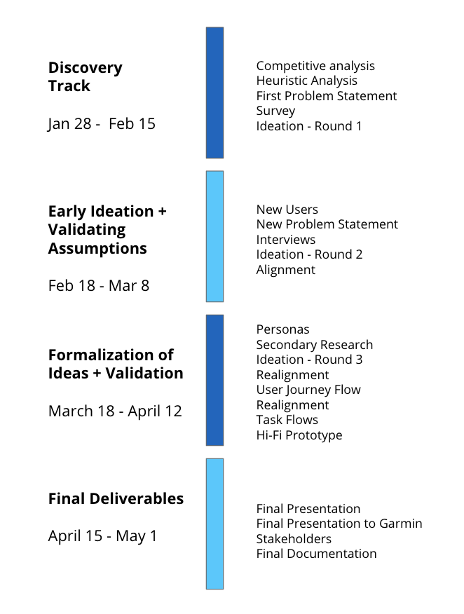
Timeline
This was a semester long project that I was a part of during my experience studio ux course at Purdue University. The duration was 4 months and we followed the following timeline over the course of the project.
Role & Responsibilities
We had 8 team members on this project with 2 co-leads. I worked very closely with the leads and the rest of the team throughout the project process, from user research, to ideation, to creating hi-fidelity designs, to validating our final designs through user testing .
02
The Problem ⚠️
Our team observed that the Gear feature lacked discoverability within the Garmin Connect app, which prevented users from integrating it’s valuable functionality into their fitness routines.
So how can we improve the user experience to make Gear more successful based on A/B testing and success rate of discoverability?
03
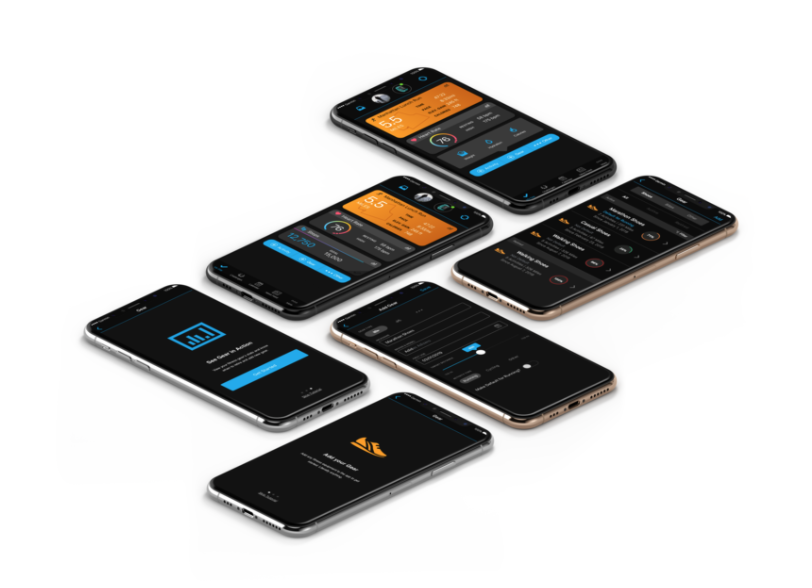
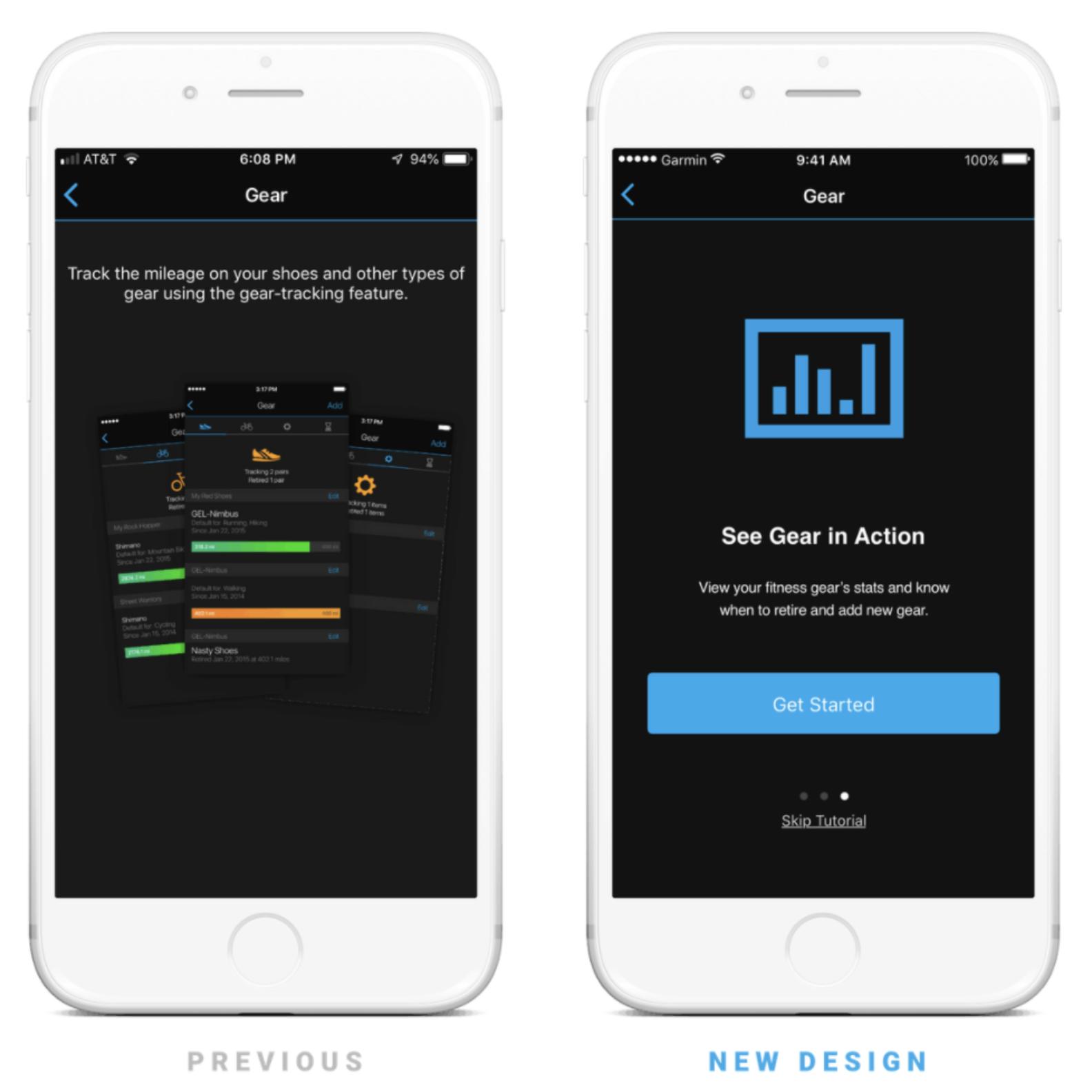
The Solution 🚀
We created high fidelity mockups that address five specific problems that we decided on with our sponsors, while also giving the Garmin Connect App a more clean aesthetic.
The five issues we located and changed were:
Filtering gear
Adding new gear
Viewing all gear
Placing gear in the bottom menu bar
Onboarding.
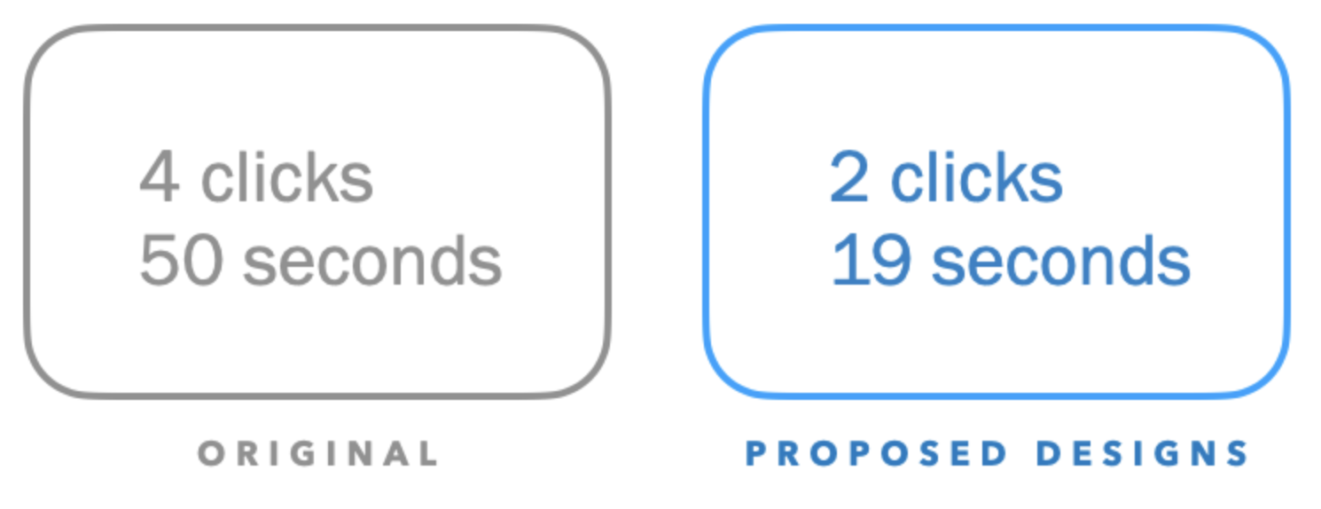
As you’ll read below in the section that discusses testing, these mockups resulted in a 100% increase in discoverability of the Gear feature within the Garmin Connect mobile application.
04
The Landscape 🗺️
We began by conducting competitive analysis on applications that accomplished similar gear-tracking and run-tracking capabilities as Garmin Connect. We identified and evaluated the strengths, weaknesses and opportunities of these competing apps to finding ways to improve the Garmin connect platform.
Results
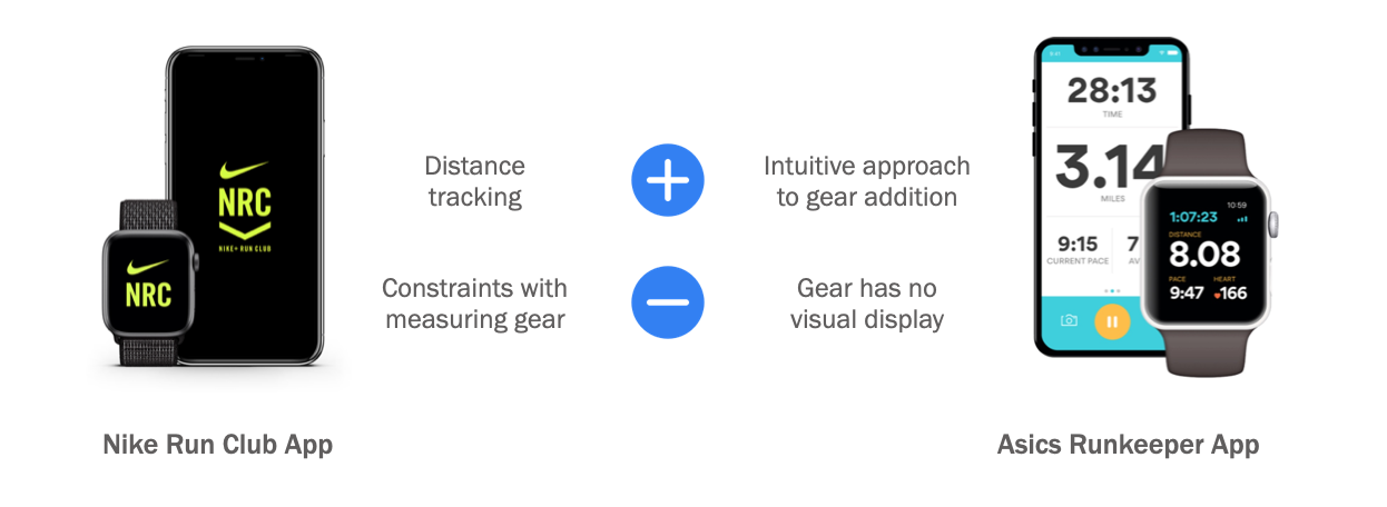
Takeaways
Suggesting brand and model suggestions offloads stress about knowing specific model names from users
It’s important to have a clear, straightforward paths to finding gear
Flexibility in adding, editing, and removing gear maximizes user customization
05
Heuristic Analysis 📝
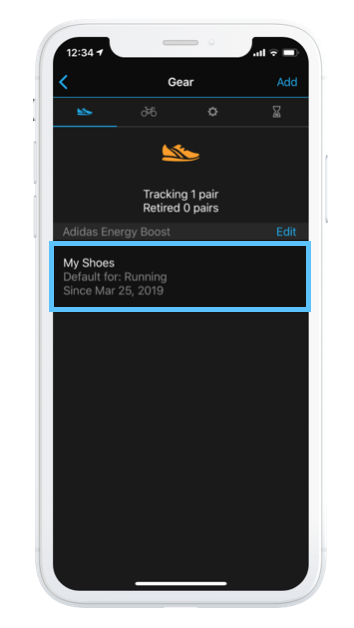
We used Nielsen’s Heuristics to conduct heuristic evaluations on both the web and mobile platform of Garmin Connect to gain a better understanding of the app and identify possible usability issues within the user interface.
Takeaways
The gear feature is not well advertised enough in the app, especially in the home screen when creating an activity.
User is unable to set his/her default Gear by choice. Instead, the app automatically detects multiple gears and sets the most recent one as the default.
06
Primary Research 📊
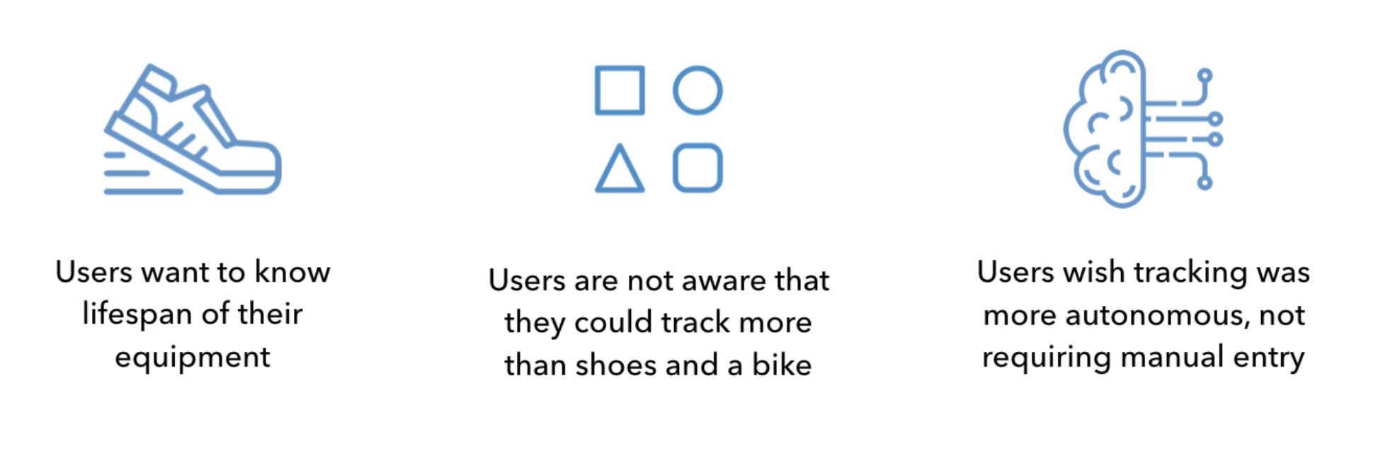
Surveys
We conducted a survey among hikers, runners, and cyclists, via Facebook to understand our user’s needs within their exercises and usage of the Garmin Connect App. We mapped out a path for each of these user types, which came to about 24 questions per participant.
Who took the survey?
Targeted 45-55 aged Garmin users and received 454 responses
Takeaways

User Interviews
We conducted qualitative interviews with runners who responded to the survey we sent out in order to gain a deeper understanding of users' knowledge of the Gear feature and find additional possible pain points in the Garmin Connect experience. Questions surrounded the users' routines, Garmin usage, and their typical flow.
Who we interviewed?
5 active runners who discovered gear by exploring the Garmin Connect App
Takeaways
07
The Users 👥
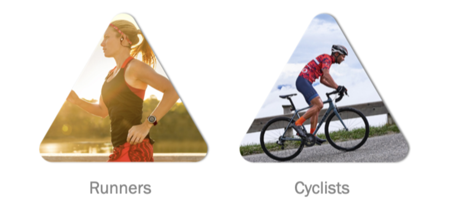
We started this project off with three user groups (hikers, runners, and cyclists but after receiving and reviewing our survey results, we chose to remove hikers from our user group, narrowing down our user group to runners and cyclists. Of our 454 survey responses, only about 10 of those were from hikers. We came to the conclusion that continuing with hikers as a main focus could deter from our overall process and findings.
08
Ideation & Iteration 🧠
Having most of our research done and ideas flowing from the discovered issues and areas for improvement, we began to brainstorm and explore possibilities of integration and visibility for Gear.

Some of our initial ideas
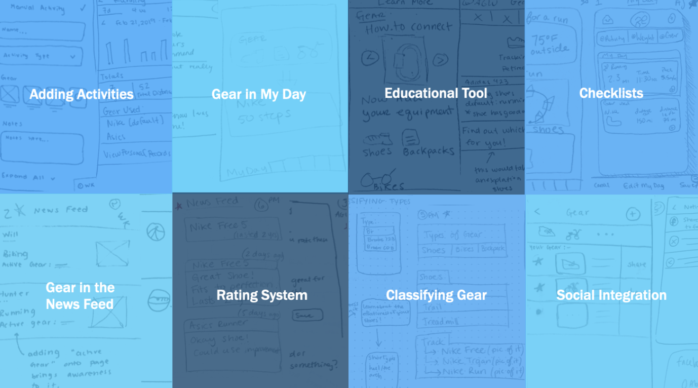
Some of our ideas from ideation round 2